

Rapid Prototyping is the process of quickly mocking up the future state of a system

YouTube
“Our mission is to give everyone a voice and show them the world.”
Freedom of Expression
Freedom of Information
Freedom of Opportunity
Freedom to Belong
Pros
Instant access to videos
YouTube will recommend videos based on search/watch history, liked videos, and channel subscriptions
Clear and easy navigation
Hover for video previews
Access to all pages
Cons
Endless scrolling to find videos
Algorithm for recommended videos isn’t always precise
Redundant page navigation (You can get to the same page 3 different ways which makes some features pointless)
Design is a bit bland
The platform takes away from watching videos with the best experience
Early Sketches
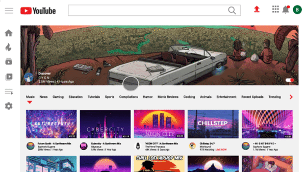
The Idea | Homepage
The homepage could showcase the “trending” video of the day.
(For the purpose of keeping up to date with what’s happening) This can be toggled to be turned off.
Compressed navigation that offers more viewing space
Homepage navigation is a dropdown of categories instead of the endless scrolling.
The Idea | Playlist
Music page layout to look more like a playlist
Have a toggle option to play the video associated with the saved song (Even if it doesn’t, it can show to stagnant video)
Auto sorting at top so you can browse by title, channel, date added, or the duration

Wireframes | Low Fidelity


Wireframes | Medium Fidelity


Wireframes | High Fidelity


Homepage | Interface

Playlist | Interface

Animations


Netflix
Netflix is the world’s leading streaming entertainment service with over 167 million paid memberships in over 190 countries enjoying TV series, documentaries and feature films across a wide variety of genres and languages. Members can watch as much as they want, anytime, anywhere, on any internet-connected screen. Members can play, pause and resume watching, all without commercials or commitments.
Pros
One price, no commercials
Access to hundreds of videos and shows
Available offline
Multiple user accounts
Multiple language options
Viewing toggle
Cons
Endless scrolling
Algorithm for recommended movies and shows isn’t always precise
Featured movie/show autoplays with volume on
No “My List” customization
“Are You Still Watching”
Lack of a dislike button
User Feedback

Based on user feedback of the pro’s and con’s that are faced when using Netflix, we can combine them into categories of the most persistent and talked about experiences.
This will help to develop a better user experience with changes that are suitable to everyone.
Early Sketches
The Idea | Homepage
Make browsing by genres easier and accessible on the Homepage
Added filter button that will allow you to sort by Rating, TV Show, Movie, Recently Added, and Children’s
A fun “Pick for Me” button that will resolve the “I don’t know what to watch” or “I just want background noise”
The Idea | My List
An added filter button to sort through “My List” easier instead of endless scrolling (i.e. genre, add date, rating, etc)
Adding a customizable “My List” button so you can create a list on whatever you want. (i.e. Cheesy Horror, Rainy Day Mood, I Need A Laugh, Cartoons, etc)

Wireframes | Low Fidelity


Wireframes | Medium Fidelity

Wireframes | High Fidelity

Homepage | Interface

My List | Interface

Animations


Ocean Conservancy
Ocean Conservancy is working with you to protect the ocean from today’s greatest global challenges.
Ocean Conservancy is a non-profit that is established in it’s impact in cleaning the oceans, reducing deforestation, looking for new solutions to better care for the environment, and is based on sustainability and love for the ocean and all that inhabits it.
Check out the Brand Redesign
Pros
Pages are responsive
Videos are entertaining and on the website longer
Navigation is easy to see and concise
Unique dropdown feature on navigation buttons
Screams “dramatic” and “urgency” which is useful for this specific company to deliver their message
Cons
Website is mostly comprised of videos and poor use of parallax
No consistent use of styles or elements
A lot of red buttons which is misleading
Very large logo
Text on page is very large and awkward
Early Sketches
The Idea | Homepage
The homepage screams with urgency and fills you with a lot of fast information on first glance. Using soft and beautiful imagery would be the first step into making a website that’s more welcoming.
Take away the solid navigation bar and use less contrasting colors.
Use of a captivating mission statement in the center of the screen along with a call to action button.
Add social media icons at the bottom of the page that stays fixed.
The Idea | Programs
Programs page would also be delivered int he same way; the use of a beautiful image with a caption in the center describing the premise of the page and a call to action button.
Continue with fixed social media icons on the bottom of the screen.
“Enter Email” option at bottom to subscribe the the mission.

Wireframes | Low Fidelity

Wireframes | Medium Fidelity

Wireframes | High Fidelity


Homepage | Interface

Programs | Interface

Other Examples


